Interpret the result
Principal Component Analysis (PCA)
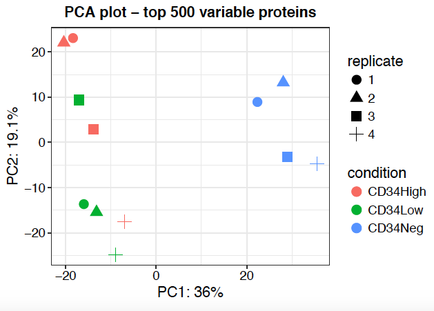
PCA plot is a good way to inspect your result regarding batch effect and reproducibility of samples from the same condition or replicates. One limitation of PCA is that only fully observed features (possibly after imputation) are included in the PCA. For TMT data, samples can optionally be colored by plex to detect batch effects across plexes.
Missing Value Heatmap
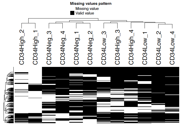
Missing value heatmap shows the missing value pattern of samples. Note that only features with missing values are shown in the heatmap.
Correlation Heatmap
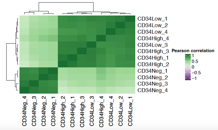
Correlation heatmap shows the Pearson correlation matrix between samples. Typically, we expect samples in the same condition to be clustered closer together.
Coefficient of Variation Plot
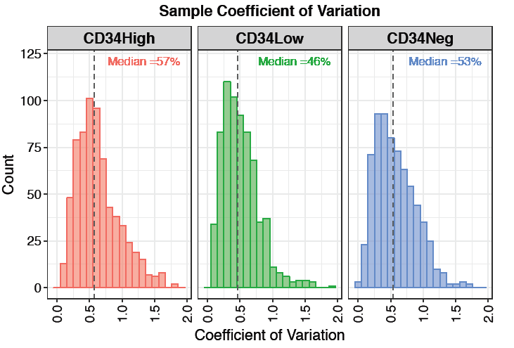
Coefficient of variation (CV) plot shows the distribution of feature-level CV for each condition. Each plot also contains a vertical line representing the median CV percentage within that condition. Low coefficient of variation means the spread of data values is low relative to the mean.
Feature Numbers
The feature numbers plot shows the number of quantified proteins (or peptides/sites) detected per sample. This is useful for identifying samples with unusually low or high detection rates that may indicate quality issues.
Sample Coverage
The sample coverage plot shows how many features are detected across different numbers of samples. It helps assess the completeness of detection across the experiment—ideally, most features should be detected consistently across all or most samples.
Density Plot
The density plot overlays the distribution of feature intensities at three stages: original (before filtering), filtered, and after imputation. This allows you to evaluate the effect of filtering and imputation on the overall intensity distribution. A large shift or broadening of the imputed distribution may indicate aggressive imputation.
Differential Expression Analysis
Differential expression (DE) analysis is performed using limma with empirical Bayes moderation. Three comparison modes are available under Advanced Options:
- All pairs (default): Generates one contrast for every pairwise combination of conditions. For example, with conditions A, B, and C, this produces A vs B, A vs C, and B vs C. Use this when you want a complete view of all differences across conditions.
- Test vs control: Compares each non-control condition against a specified control. Enter the name of the control condition in the “Name(s) of control condition” field. For example, with control “WT” and conditions KO1, KO2, this produces KO1 vs WT and KO2 vs WT. Use this for experiments with a clear reference group.
- One vs others: Compares each condition against the average of all remaining conditions combined. For example, with conditions A, B, and C, this produces A vs (B+C), B vs (A+C), and C vs (A+B). Use this to identify features uniquely associated with each condition.
Results for each contrast include log2 fold change, p-value, and adjusted p-value (FDR), and are available in the downloadable results table. The significance thresholds (adjusted p-value cutoff and log2 fold change cutoff) can be configured in Advanced Options.
Volcano Plot
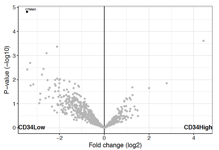
Volcano plot is the most commonly used visualization for differential expression analysis. The x-axis shows the log2 fold change and the y-axis shows the -log10 p-value (or adjusted p-value). Features passing both the fold change and p-value thresholds are colored to indicate up- or down-regulation.
Heatmap
The heatmap displays the relative abundance of significantly differentially expressed features across all samples, with hierarchical clustering applied to both rows (features) and columns (samples). Cluster assignments can be downloaded as a CSV file for downstream analysis.
Feature Plot
The feature plot shows the abundance of a selected protein or feature across all samples as a boxplot or violin plot, grouped by condition. This is useful for inspecting the abundance pattern of individual features of interest.
Dual Comparison
The dual comparison scatter plot allows side-by-side comparison of log2 fold changes from two different contrasts. Each point represents a feature, colored by its significance status: red points are significant in both comparisons, orange in comparison 1 only, blue in comparison 2 only, and grey in neither. This is useful for identifying features that change consistently or divergently across two conditions.
Absence/Presence Analysis
The Absence/Presence tab provides tools for exploring which features are detected in each condition, independently of quantitative differential expression. It includes three visualizations:
- Venn Plot: Shows the overlap of detected features between up to three conditions. Use the condition selectors to choose which groups to compare. Set Condition 3 to “NONE” to generate a 2D Venn diagram.
- UpSet Plot: An alternative to Venn diagrams that scales to more than three conditions. Bars show the size of each intersection set, making it easy to identify features unique to or shared across multiple conditions.
- Jaccard Similarity: Displays pairwise Jaccard similarity scores between conditions based on feature detection overlap.
The filtered results table lists features that meet the selected detection thresholds (minimum number of samples present per condition) and can be downloaded as a CSV file.
Enrichment Result
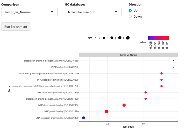
Enrichment analysis gives you a rough idea of functional changes between two conditions. FragPipe-Analyst supports two enrichment tabs:
- Gene Ontology (GO): Tests for enrichment in GO Molecular Function, Cellular Component, or Biological Process terms. Currently supports human data only.
- Pathway Enrichment: Tests for enrichment in pathway databases including Hallmark, KEGG, Reactome, and WikiPathways. Human and mouse data are supported.
Enrichment is based on Enrichr with background correction through a hypergeometric test. You can choose to run enrichment on upregulated or downregulated features separately, and optionally use the whole detected proteome as the background.