FragPipe-Analyst for TMT data analysis
Introduction
This tutorial documents how to use FragPipe-Analyst to analyze quantitative proteomics results generated by the TMT related workflows of FragPipe. You can download the example dataset here under “TMT_ccRCC_proteome” folder. It contains 3 out of the total 23 TMT plexes in the CPTAC clear cell renal cell carcinoma (ccRCC) paper: Integrated Proteogenomic Characterization of Clear Cell Renal Cell Carcinoma, Cell (2019).
Input
You will need two things for FragPipe-Analyst.
-
[abundance/ratio]_gene_[normalization choice].tsv generated by TMT-Integrator in FragPipe. (
ccRCC_prot_abundance_MD_3plex.tsvfor this tutorial) -
experiment_annotation.tsv file as metadata. It will be automatically generated by FragPipe released recently, but don’t upload the file blindly generated, you will need to annotate some columns (It’s already annotated and provided as
annot_3plex.tsvhere).
The following table shows the first 3 rows in the sample experiment_annotation.tsv file. The goal of the analysis is to compare protein expression between Tumor and Normal.
| plex | channel | sample | sample_name | condition | replicate |
|---|---|---|---|---|---|
| 16 | 126 | C3N-01179-T | C3N_01179_T | Tumor | 1 |
| 16 | 127N | C3N-00606-T | C3N_00606_T | Tumor | 1 |
| 16 | 127C | C3N-01179-N | C3N_01179_N | Normal | 1 |
After you understand the input, you could upload those two files (ccRCC_prot_abundance_MD_3plex.tsv and annot_3plex.tsv) to FragPipe-Analyst. Don’t forget to choose TMT in the dropdown menu. After you upload files, FragPipe-Analyst will process the result and present the result shortly. Following material covers the deatils about what you will see.
Output
Result Plots (Upper Right Panel)
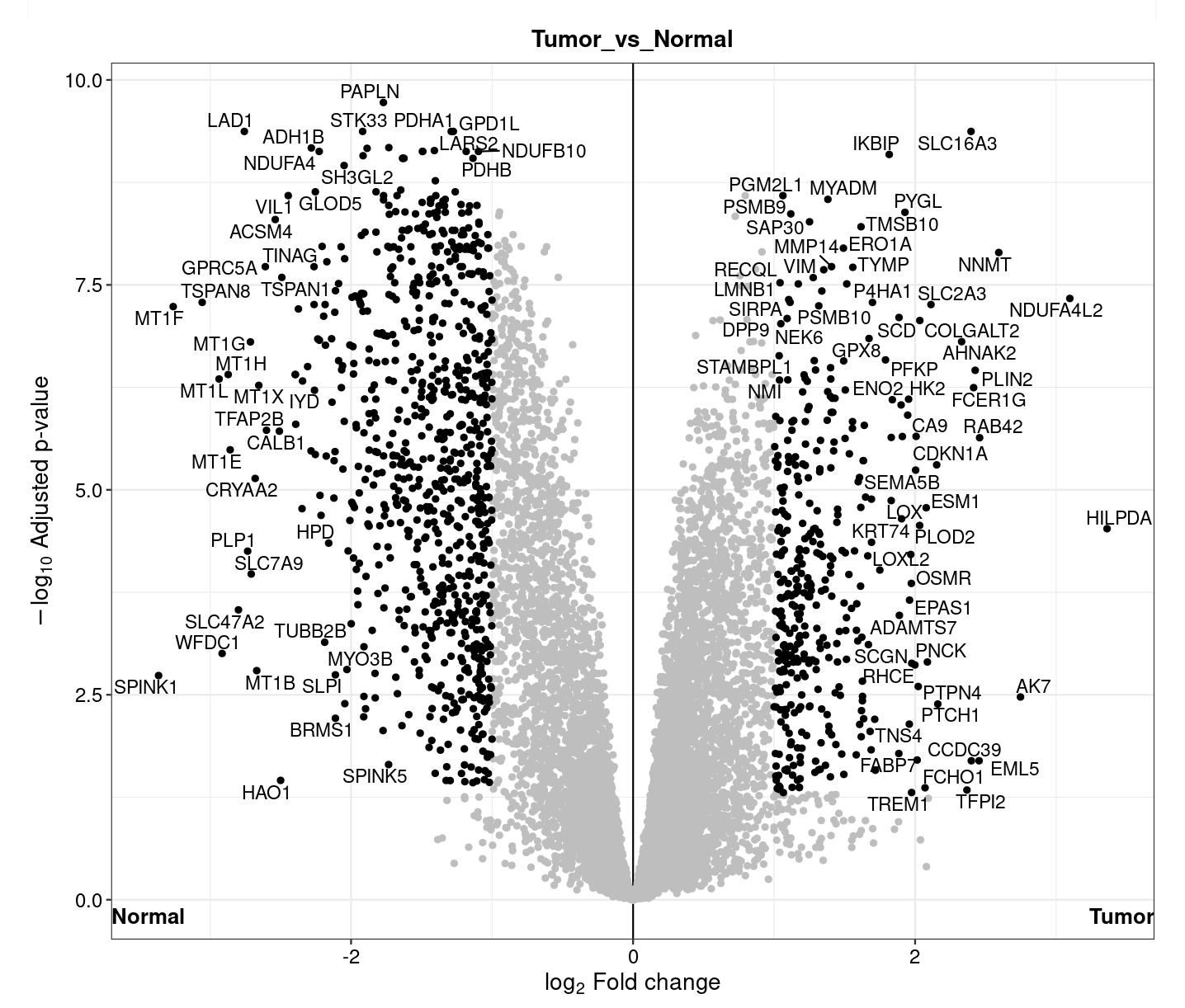
- Volcano plot: A volcano plot is generated for each pairwise comparison. It is a graphical visualization by plotting the “Fold Change (Log2)” on the x-axis versus the –log10 of the “ p-value” on the y-axis. Interesting candidate proteins are located in the left and right upper quadrant. User can toggle the display name checkbox to highlight names of differentially expressed proteins or use ‘adjusted p-value’ as y-axis. Importantly, user can highlight protein or their interest (colored maroon) by selecting the row from “Results Table”. This highlighted plot can be downloaded using “ Save Highlighted Plot” button.
-
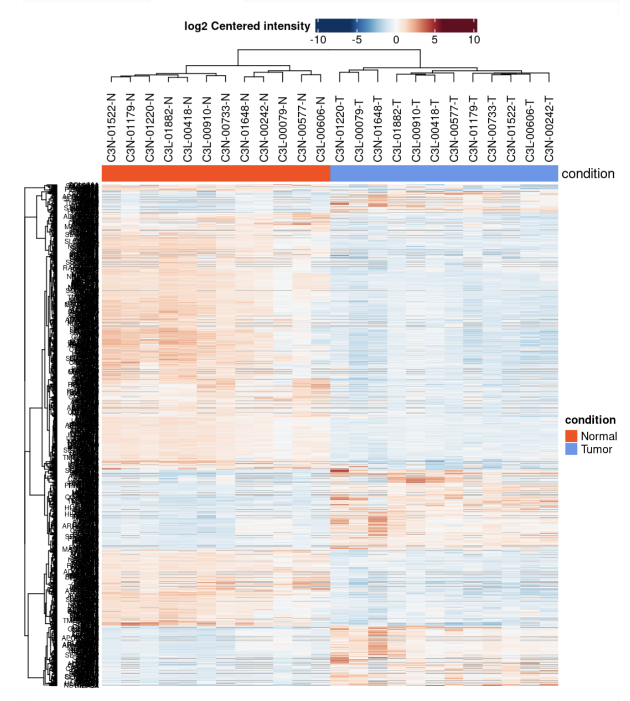
Heatmap: The heatmap representation gives an overview of all significant/differentially expressed proteins (rows) in all samples (columns). This visualization allows the identification of general trends such as if one sample or replicate is highly different compared to the others and might be considered as an outlier. Additionally, the hierarchical clustering of samples (columns) indicates how related the different samples are and hierarchical clustering of proteins (rows) identifies similarly behaving proteins.
With our sample data, the heatmap shows expected separation between tumor and nomral samples and a few protein clusters behaving contrastingly different between the groups. User also have option to download protein information from individual cluster.
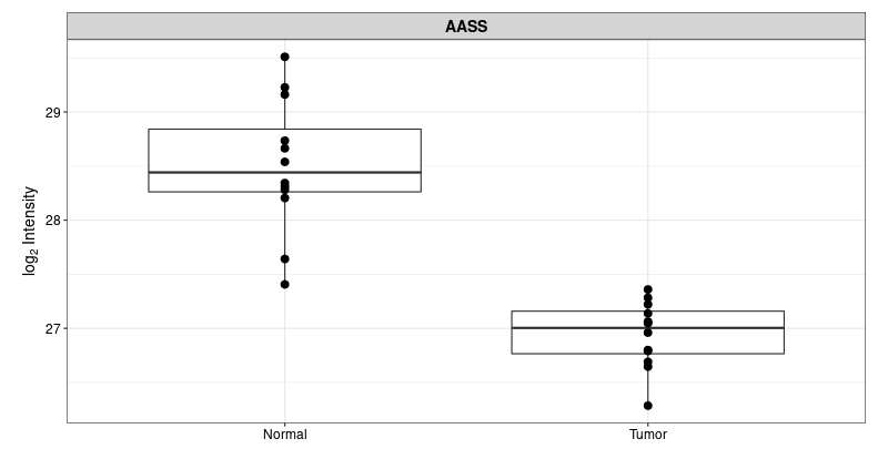
- Protein plot: Selecting a gene from the ‘Results Table’, A box plot or a violin plot will be shown comparing expression of that gene between conditions.
QC Plots (Bottom Left Panel)
-
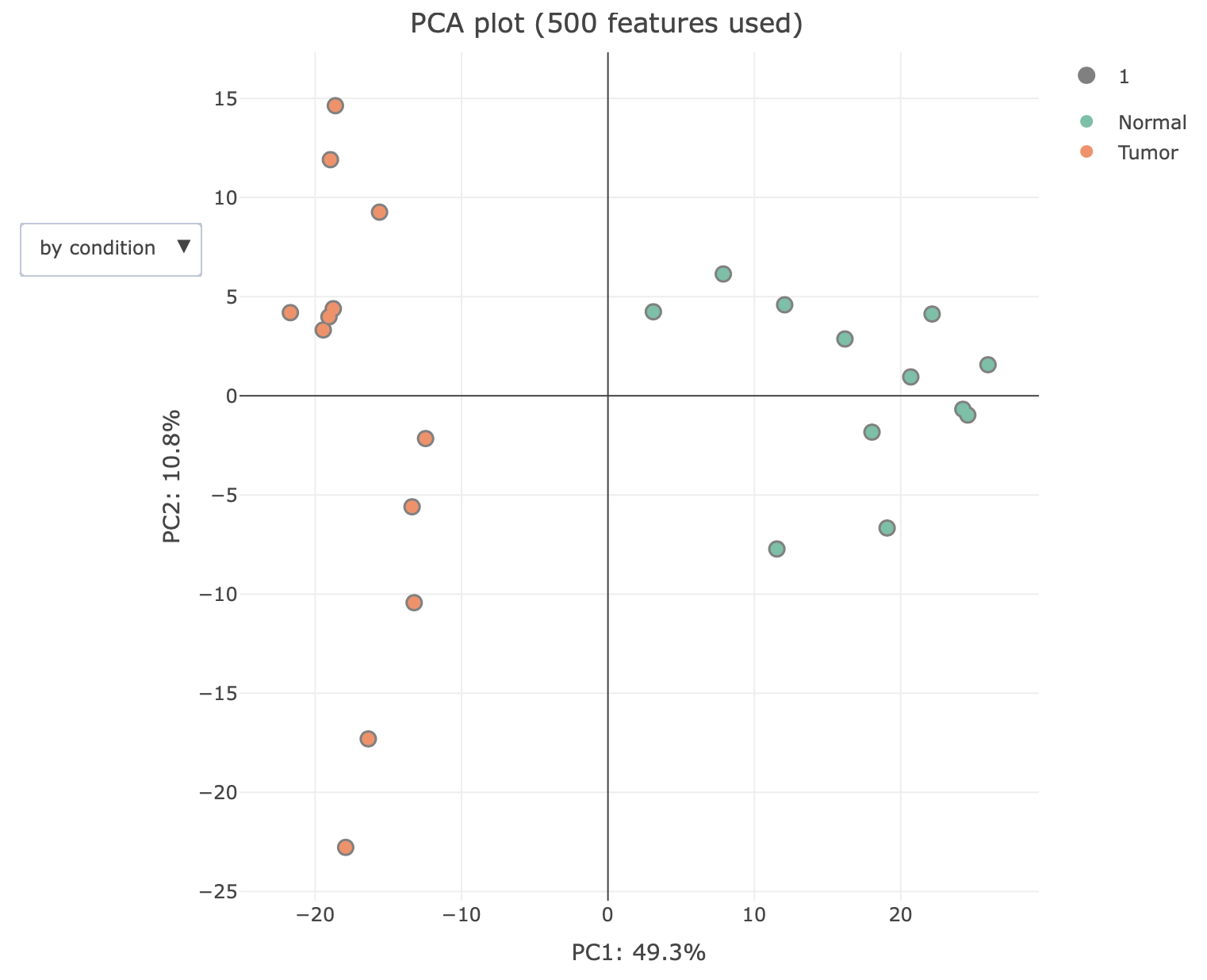
PCA plot: A Principal Component Analysis(PCA) is a technique used to emphasize variation and bring out strong patterns in a dataset. PC1, which is a linear combination of all features, shown on the x axis, explains the most variation of the data, and followed by the rest of PCs. In brief, the more similar 2 samples are, the closer they cluster together. For further information, here are a few links, which explains the principals of PCAs: Info and Basic introduction
After PCA analysis with our sample data, samples are presented in the scatter plot below. Tumor and Normal samples are well separated by PC1 values.
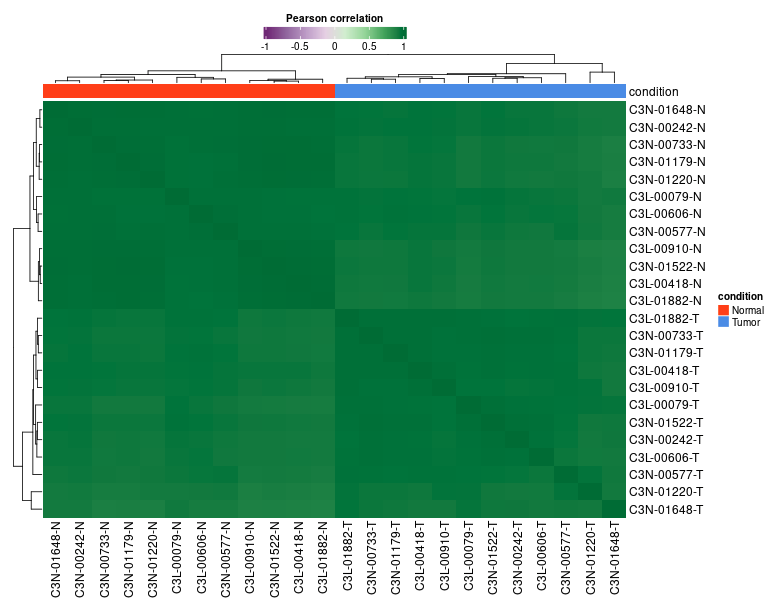
- Sample Correlation Plot: A correlation matrix is plotted as a heatmap to visualize the Pearson correlation coefficients between the different samples.
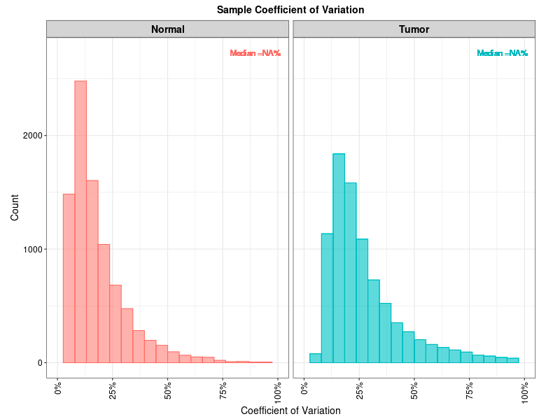
- Sample CVs Plots: A plot representing distribution of protein level coefficient of variation for each condition. Each plot also contains a vertical line representing median CVs percentage within that condition.
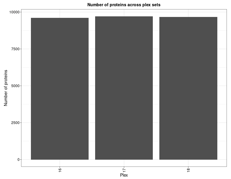
- Protein Numbers: A bar-plot representing number of proteins identified and quantified in each TMT plex.
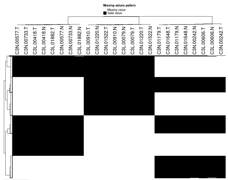
- Missing values- Heatmap: To explore the pattern of missing values in the data, a heatmap is plotted indicating whether values are missing (0) or not (1). Only proteins with at least one missing value are visualized.
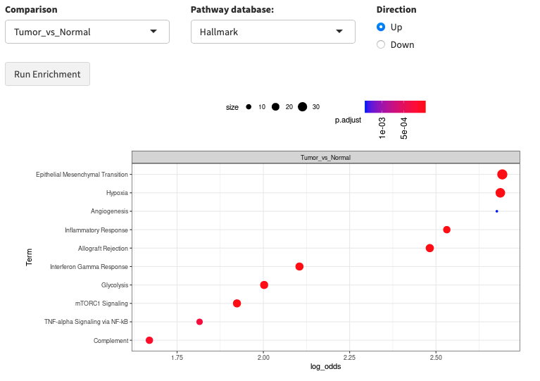
Enrichment Analysis (Bottom Right Panel)
FragPipe-Analyst provides enrichment analysis for both Gene Ontology(GO) and pathways.
-
GO: Selecting the comparison of interest, the GO database (Molecular Function/Cellular Component/Biological Process), and direction (up regulated or down regulated). It checks the differentially expressed (DE) list of genes against known sets of genes. The background gene list is composed with IDs appeared in the input data. A hypergeometric test is performed. Log odds ratio (log_odds) is calculated as
log2((IN/OUT)/(bg_IN/bg_OUT)), where IN and OUT are the number of DE genes in and outside of a gene set of interest, and bg_IN and bg_OUT are the nubmer of other genes in and outside of a gene set of interest. Gene sets used are fetched from the Enrichr API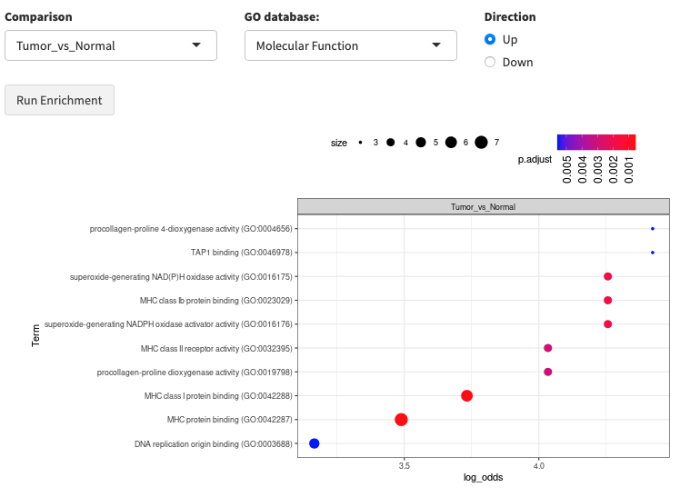
-
Pathway enrichment: Same algorithm is used as the Gene Ontology part. Pathway database choices are Hallmark, KEGG and Reactome.
Result table
- Results Table: Includes names (Gene names), Protein Ids, Log fold changes/ ratios (each pairwise comparisons), Adjusted p-values (applying FDR corrections), p-values, Boolean values for significance, average protein intensity (log transformed) in each sample.
Download options
- Download tables (csv format)
- Results: Same as Results Table
- Unimputed data matrix: Original protein intensities before imputation in each sample.
- Imputed data matrix: Protein intensities after performing selected imputation method
- Full results: Combined table of all above data outputs i.e. with and without imputation information, along with fold change and p-values.
-
Download Report (word format) A summary report document including some statistics and plots.
-
Download Plots (PDF format) A PDF document containing all the plots generated during the analysis.
Advanced Options and Details
Differential expression analysis (DE)
As you can see, FragPipe-Analyst functionality relies on differential expression (DE) analysis. Internally, we use a Bioconductor package limma to carry out the DE analysis on each protein. Contrasts are built automatically from condition levels provided by the user allowing the generation of results for all possible comparisons. Multiple test adjustment are done with user specified options (default with “BH”). It also takes into account user defined cutoffs to filter significantly differentially expressed proteins.
Significant protein filtering criteria
- Adjusted p-value cutoff: default is 0.05
- Log2 fold change cutoff: default is 0.7
Missing value imputation options
- No imputation: This is the default setting.
- Perseus-type: This method is based on popular missing value imputation procedure implemented in Perseus. The missing values are replaced by random numbers drawn from a normal distribution of 1.8 standard deviation down shift and with a width of 0.3 of each sample.
- MLE: Maximum likelihood-based imputation method using EM algorithm.
- knn: Missing values replace by nearest neighbor averaging technique
- min: Replaces the missing values by the smallest non-missing value in the data.
- zero: Replaces the missing values by 0.
False Discovery Rate (FDR) correction option
- Benjamin Hochberg (BH) method
- local and tail area based: Implemented in fdrtools
In sample data demonstration, we set Adjusted p-value cutoff at 0.05, Log2 fold change cutoff at 1 and Type of FDR correction at Benjamini Hochberg.